The starting line to achieving any good user interface and mobile app design – The grid system.
Just like any good design layout in any medium, the foundation of our work starts on a grid system. There is an invisible grid under every surface of the apps we use on a daily basis, and it is these grids which guide us as designers to create elegant user interfaces, and in return, guide your users to a pleasurable user experience. The grid is the core of any good mobile app user interface!
Every element of your app design is based on a grid.
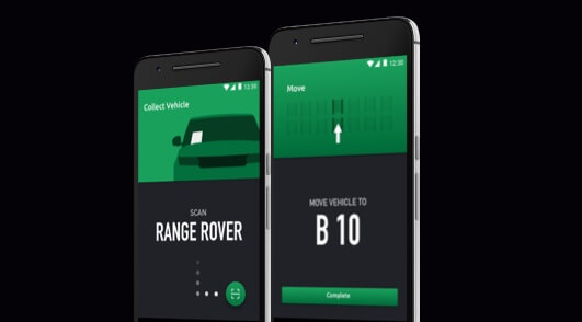
Let’s take a look underneath the hood of the recognisable Apple built in iOS Stopwatch app.

Take note of the equal spacing: text and objects fit perfectly within a disciplined grid layout, all accommodated around the operating systems familiar layout.
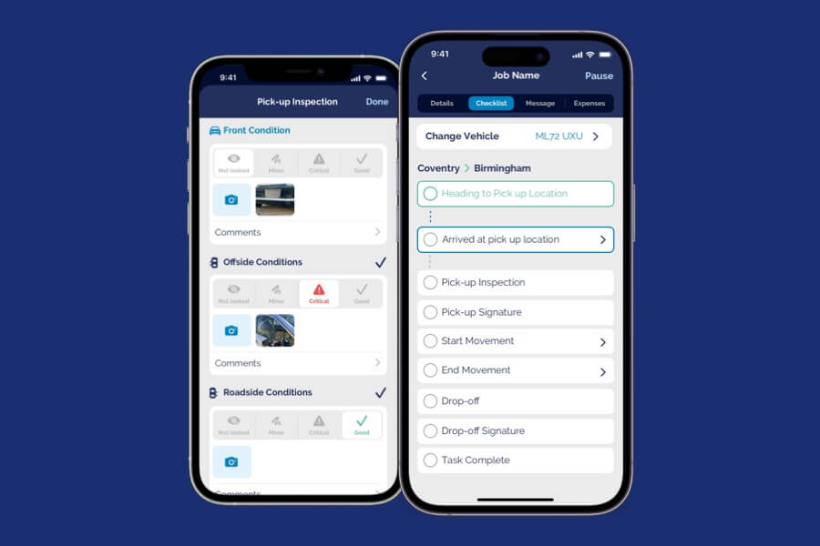
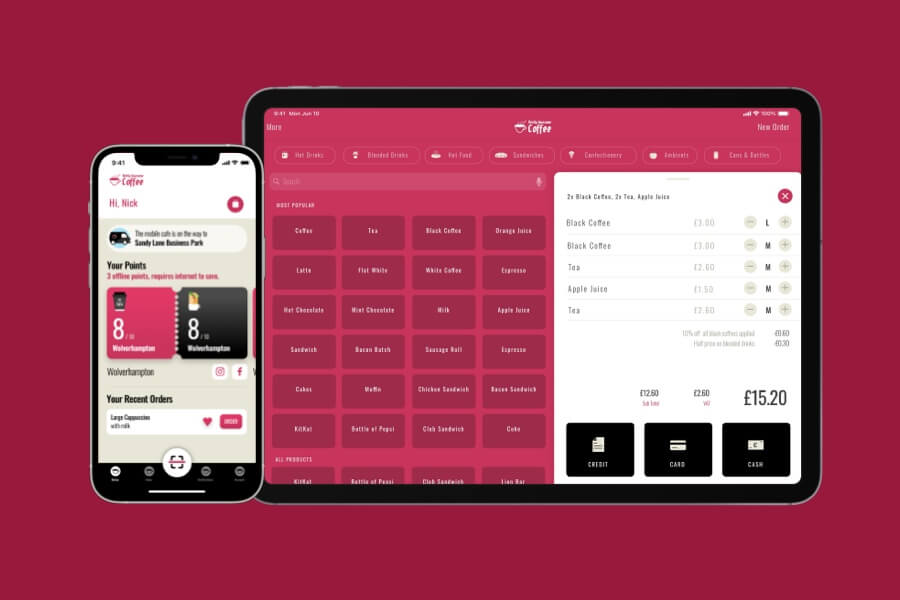
Our own designs follow a grid system
In comparison, take a look at the examples of the apps created by Apps Plus below, where the same fundamentals and principles are used within a controlled and equal spaced grid system.

There are consistent similarities with the height of the header, equal margin on either sides of the screen and spacing between the rows. Starting with a grid helps us guide our design and focus on layout and functionality before moving to aesthetics and colour schemes. Take a look at another case study by Apps Plus and how wireframes transformed into a beautiful user interface for PureGym.